Here’s a scenario every investor eventually runs into: two mutual funds post nearly identical returns over the same year. On paper, they look like twins. But dig a little deeper, and you’ll find that one fund got there by riding out wild swings, while the other cruised along steadily. Same destination, very different journeys and very different levels of risk.
Returns alone won’t show you that difference. That’s the gap the Sharpe Ratio was built to fill.
A Look Into Sharpe Ratio
The Sharpe Ratio formula was developed by William F. Sharpe, an economist who later won a Nobel Prize for his work on asset pricing. At its core, the ratio answers one simple question: how much extra return did you actually earn for every bit of risk you took on?
It doesn’t replace looking at returns — it puts them in context. A fund that returns 15% might sound great, but if it got there through a rollercoaster of ups and downs, that number means something very different than a fund that returned 15% smoothly. The Sharpe Ratio is what lets you tell those two stories apart.
Generally speaking, the higher the number, the more efficiently an investment has rewarded you for the risk involved. You’ll see this ratio used across mutual funds, equity portfolios, ETFs, and hybrid funds — basically anywhere returns and volatility need to be weighed against each other.
Let’s Take a Look at the Formula
It’s a straightforward equation:
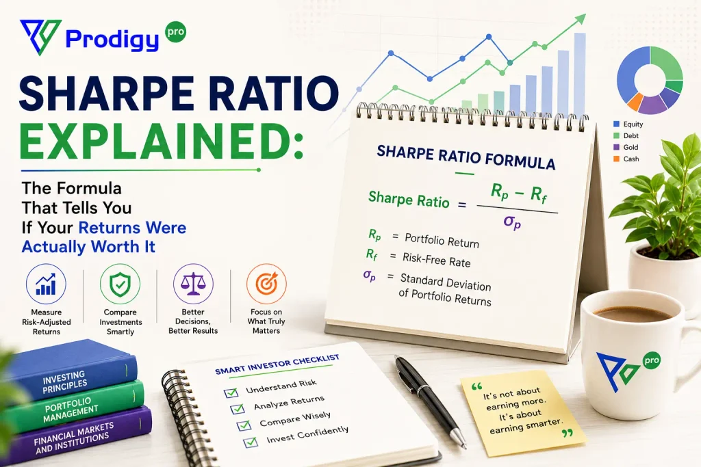
Sharpe Ratio = (Portfolio Return − Risk-Free Rate) ÷ Standard Deviation
Three pieces make up that formula, and each one is doing real work:
Portfolio Return refers to the gain or loss your investment generated over a specific period.
Risk-Free Rate is the return you’d get from something with essentially zero default risk government bonds are the usual benchmark. It represents the baseline you could earn without really trying.
Standard Deviation captures how much the returns bounced around during that period. A fund with high standard deviation had a bumpier ride; one with low standard deviation was more predictable.
Put together, these three numbers tell you whether the returns you earned were actually worth the turbulence you sat through to get them.
For Instance
Say a mutual fund delivered:
- Portfolio Return: 15%
- Risk-Free Rate: 5%
- Standard Deviation: 10%
Run it through the formula:
(15 − 5) ÷ 10 = 1.0
A Sharpe Ratio of 1.0 means the fund generated one unit of excess return for every unit of risk it exposed you to. Not bad — but as you’ll see below, it’s just the starting point for “good.”
Reading the Number: What Counts as Good?
Once you’ve got a Sharpe Ratio in hand, here’s roughly how to read it:
| Sharpe Ratio | What It Suggests |
| Below 1 | Poor risk-adjusted return |
| 1 to 2 | Good |
| 2 to 3 | Very good |
| Above 3 | Excellent |
One caveat worth remembering: a “good” Sharpe Ratio in one category doesn’t always translate to another. A debt fund and a small-cap equity fund operate on completely different risk scales, so comparisons only really make sense within the same asset class.
Why Bother With This Metric at All
It’s tempting to just chase whichever fund posted the biggest returns last year. The Sharpe Ratio pushes back on that instinct a little, and for good reason. It helps you:
- Compare similar mutual funds on equal footing, rather than by raw returns alone
- See risk-adjusted performance instead of just the headline number
- Figure out whether extra returns were actually worth the extra risk
- Pick funds that strike a genuinely efficient balance between reward and volatility
- Judge fund managers on consistency, not just a lucky stretch
If you’re investing for the long haul, this is one of the more useful lenses to look through before committing your money.
What Makes It Useful
A few things make the Sharpe Ratio worth keeping in your toolkit:
It gives you a standardised way to stack investments up against each other, rather than eyeballing return charts. It factors risk directly into the equation instead of treating returns as the whole story. It’s particularly handy when narrowing down a shortlist of mutual funds, and it nudges you toward a more balanced view of investing — one where chasing the highest number isn’t automatically the smartest move.
Where It Falls Short
No metric is perfect, and the Sharpe Ratio has some real blind spots worth knowing about.
It assumes returns follow a normal distribution — a tidy bell curve which isn’t always how markets actually behave. It’s built entirely on historical data, and past performance is never a guarantee of what comes next. It also doesn’t distinguish between “good” volatility (sudden upside spikes) and “bad” volatility (the downside drops investors actually worry about) to the Sharpe Ratio, both count the same way. And the result can shift quite a bit depending on which time period you choose to measure.
Because of these gaps, it’s best used alongside other metrics Alpha, Beta, and the Sortino Ratio among them rather than as a standalone verdict.
Sharpe Ratio vs. Sortino Ratio
These two often get mentioned in the same breath, and they’re related but not identical.
| Sharpe Ratio | Sortino Ratio |
| Considers total volatility | Considers only downside volatility |
| Good for overall risk assessment | Focuses specifically on harmful risk |
| Measures total portfolio risk | Measures only the risk investors actually dread |
The Sortino Ratio essentially refines the Sharpe Ratio’s approach by ignoring the “good” swings and focusing purely on the downside. Many investors use both together, since each one fills in a gap the other leaves behind.
Conclusion
Chasing high returns is the easy part, the harder, more useful question is whether those returns were worth the risk it took to get there. That’s exactly what the Sharpe Ratio helps you figure out.
It won’t give you the whole picture on its own, though. Pair it with Alpha, Beta, Standard Deviation, and the Sortino Ratio, and you’ll walk into your next investment decision with a much clearer sense of what you’re actually signing up for.